Ashmolean Review 2019/20
30.11.2020
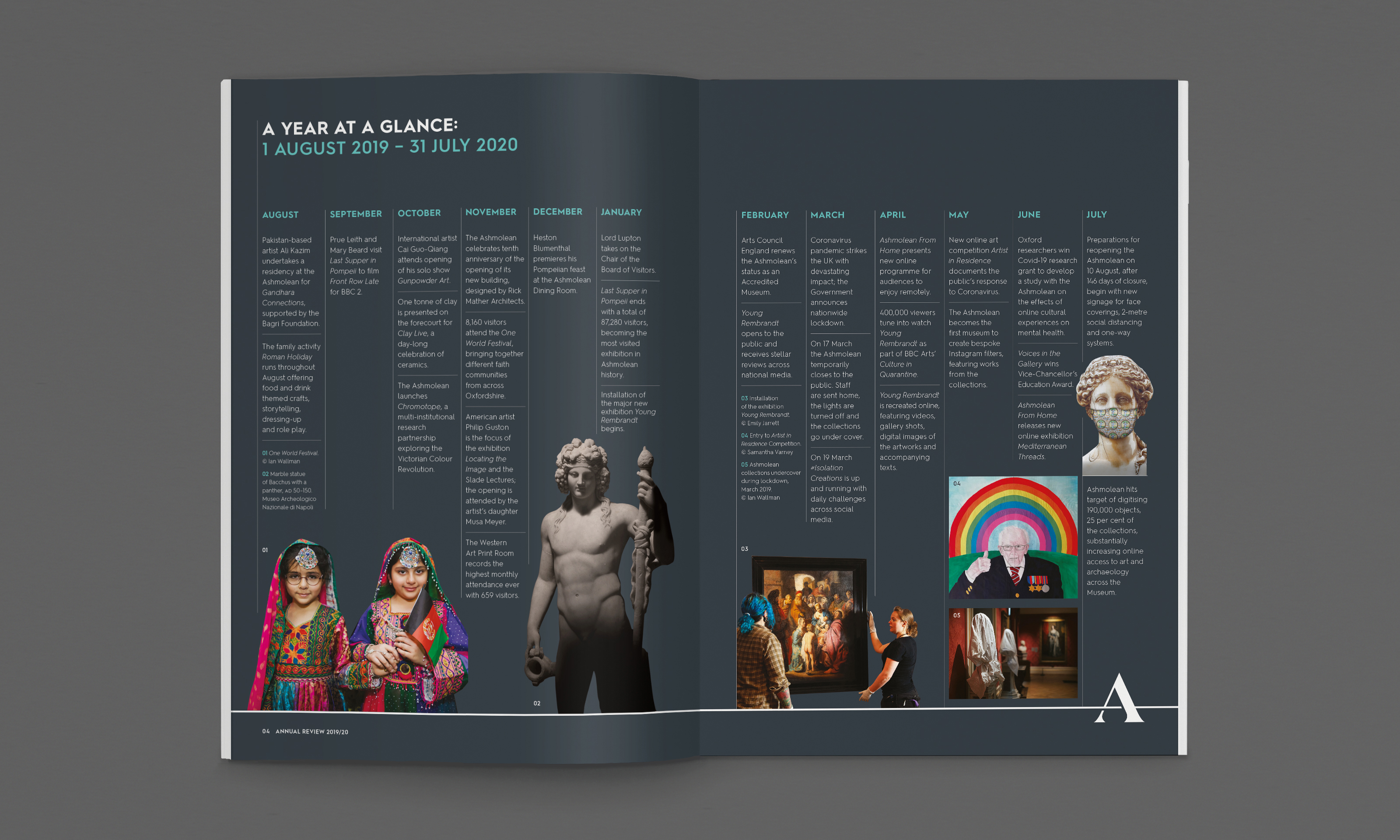
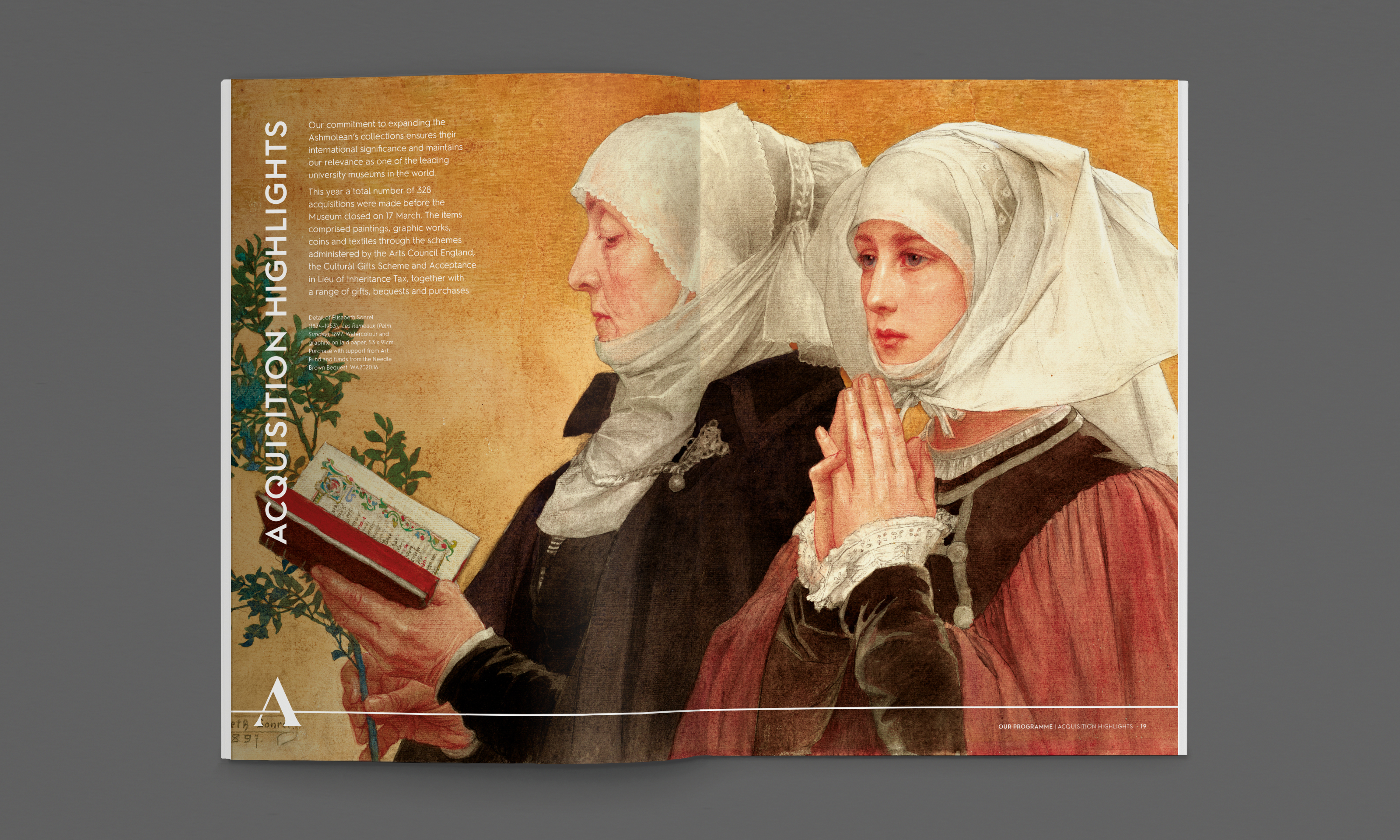
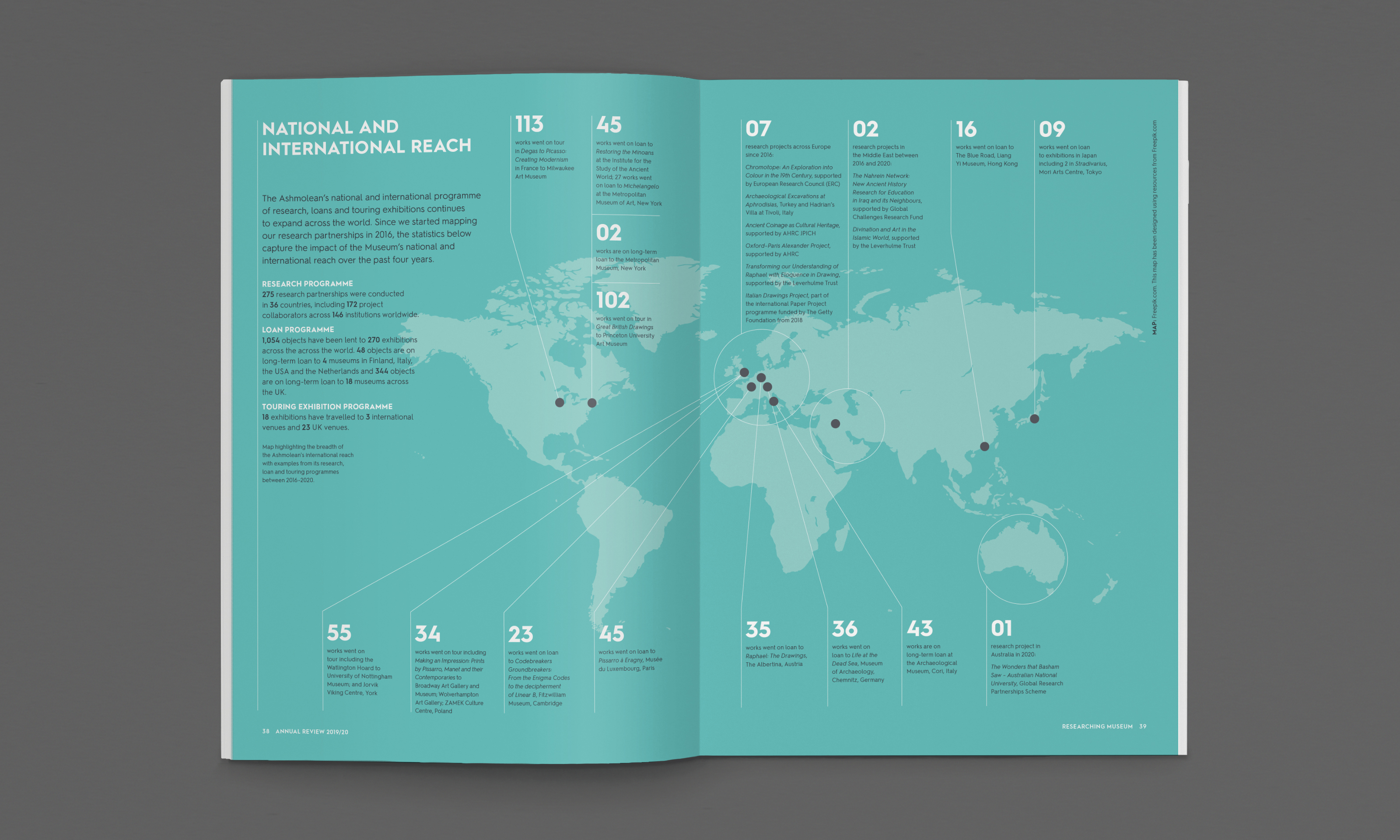
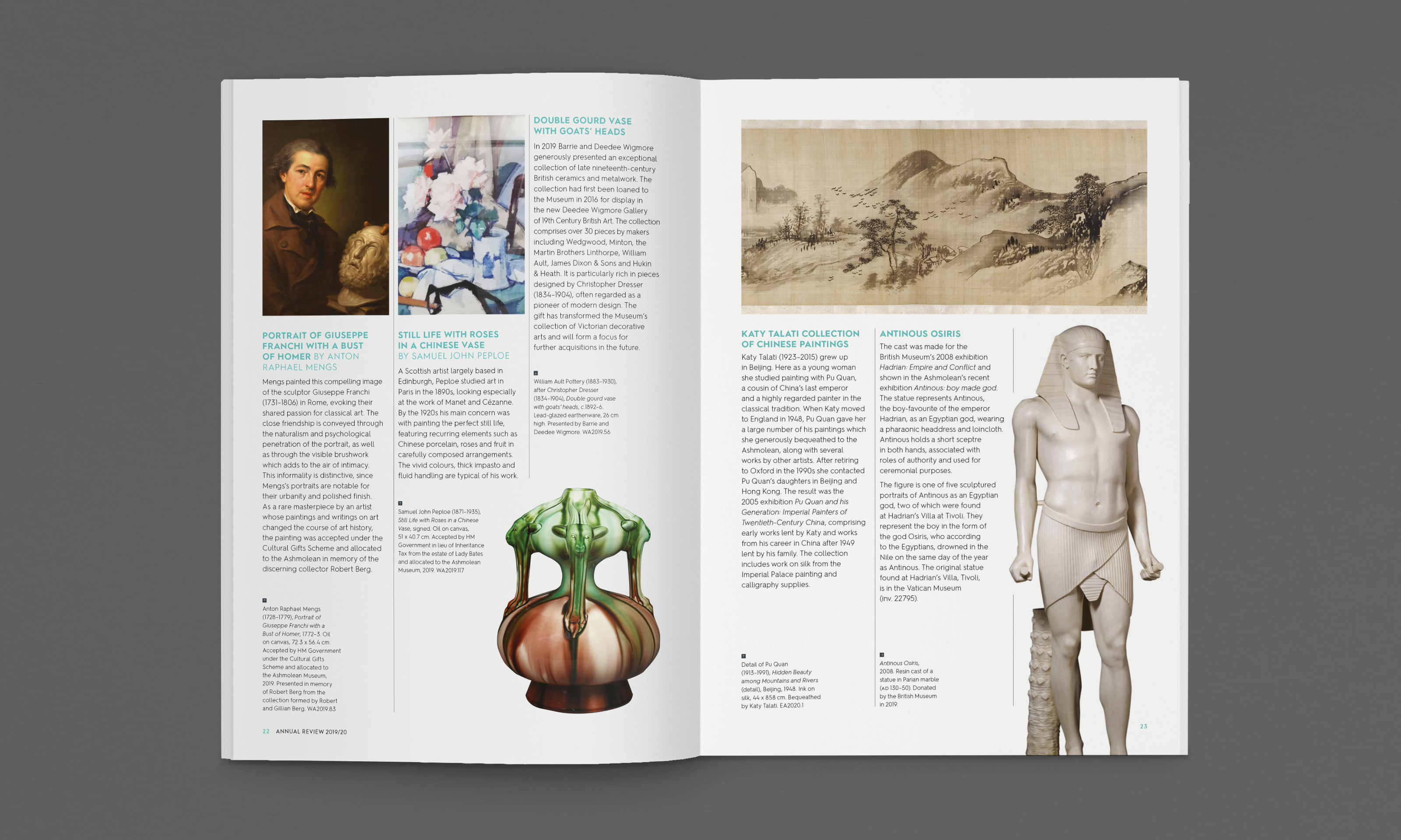
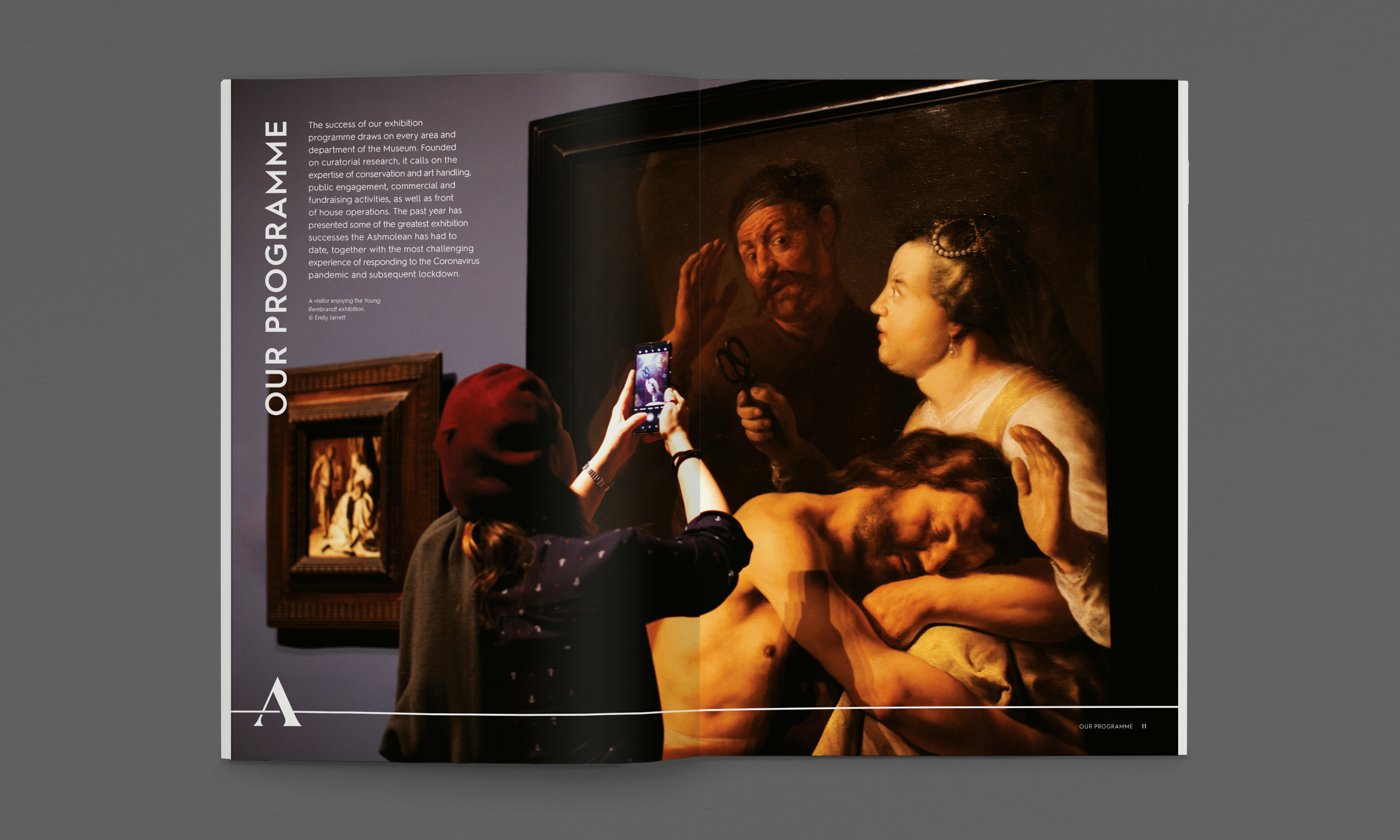
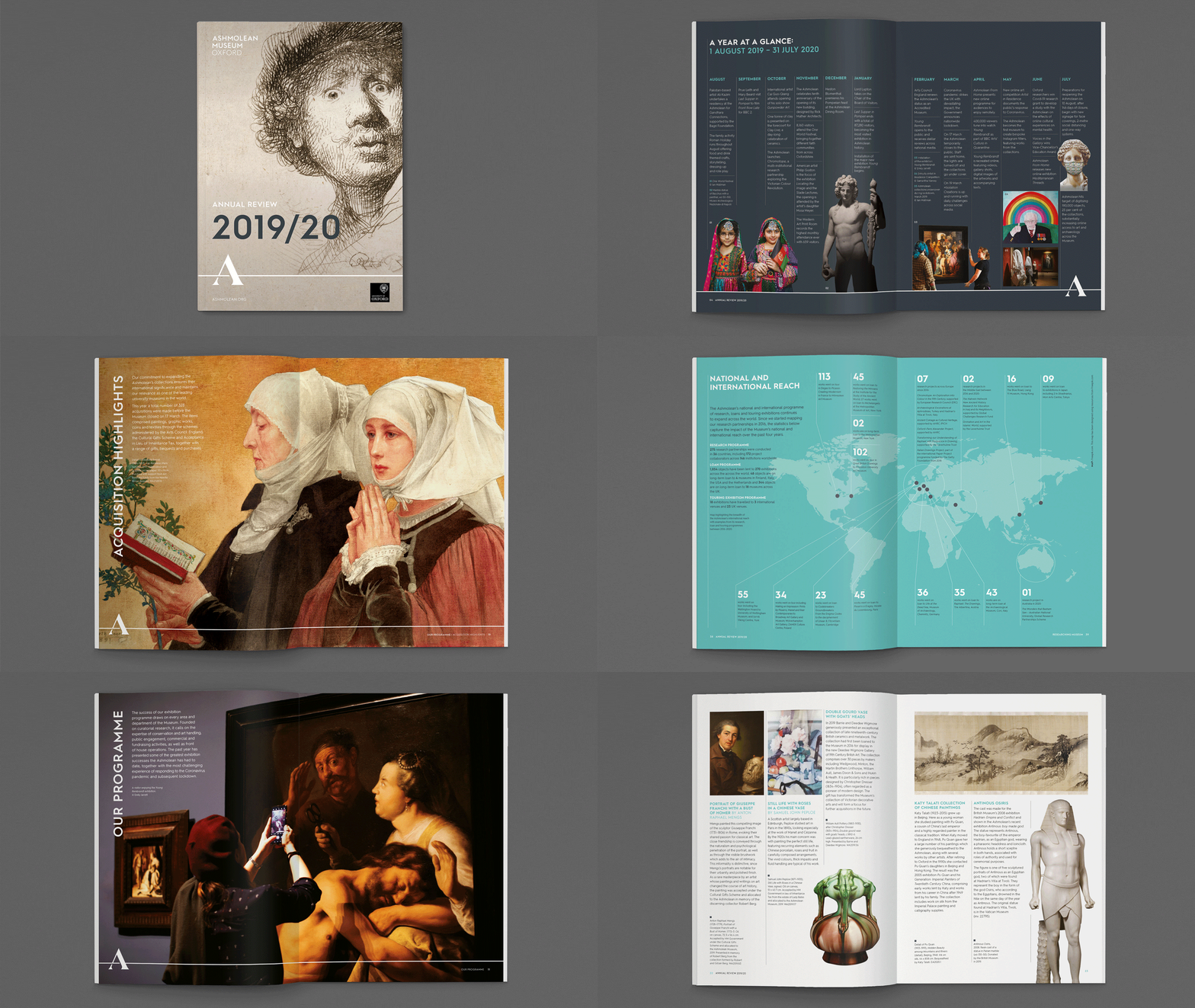
Having developed a new brand identity with the Ashmolean Museum Oxford last year, it was great to be invited to produce this year’s Annual Review. Giving us the opportunity to express the new identity in print, we brought the brand’s timeline concept to life with an opening spread presenting the Ashmolean’s eventful ‘year to view’. The line then runs through the Review with the ‘A’ logo highlighting each chapter heading. The layout is designed to subtly frame a selection of the Ashmolean’s worlds-class exhibits and latest acquisitions.
“We are delighted with how the Ashmolean’s new brand identity is working across all our comms and are thrilled with Blast’s redesign of our Annual Review. It looks fresh and contemporary yet classic too. Blast has introduced a whole range of new features that are really effective, making the Review a pleasure to read.”
Theresa Nicolson
Marketing Manager – Ashmolean Museum Oxford
