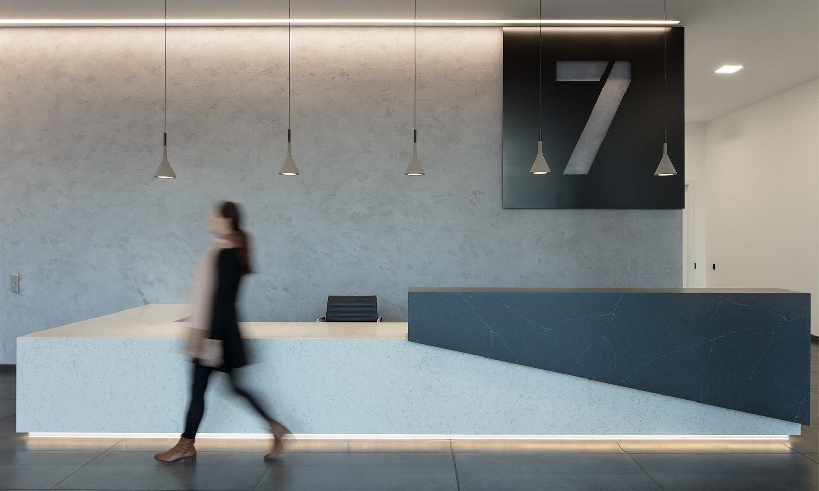
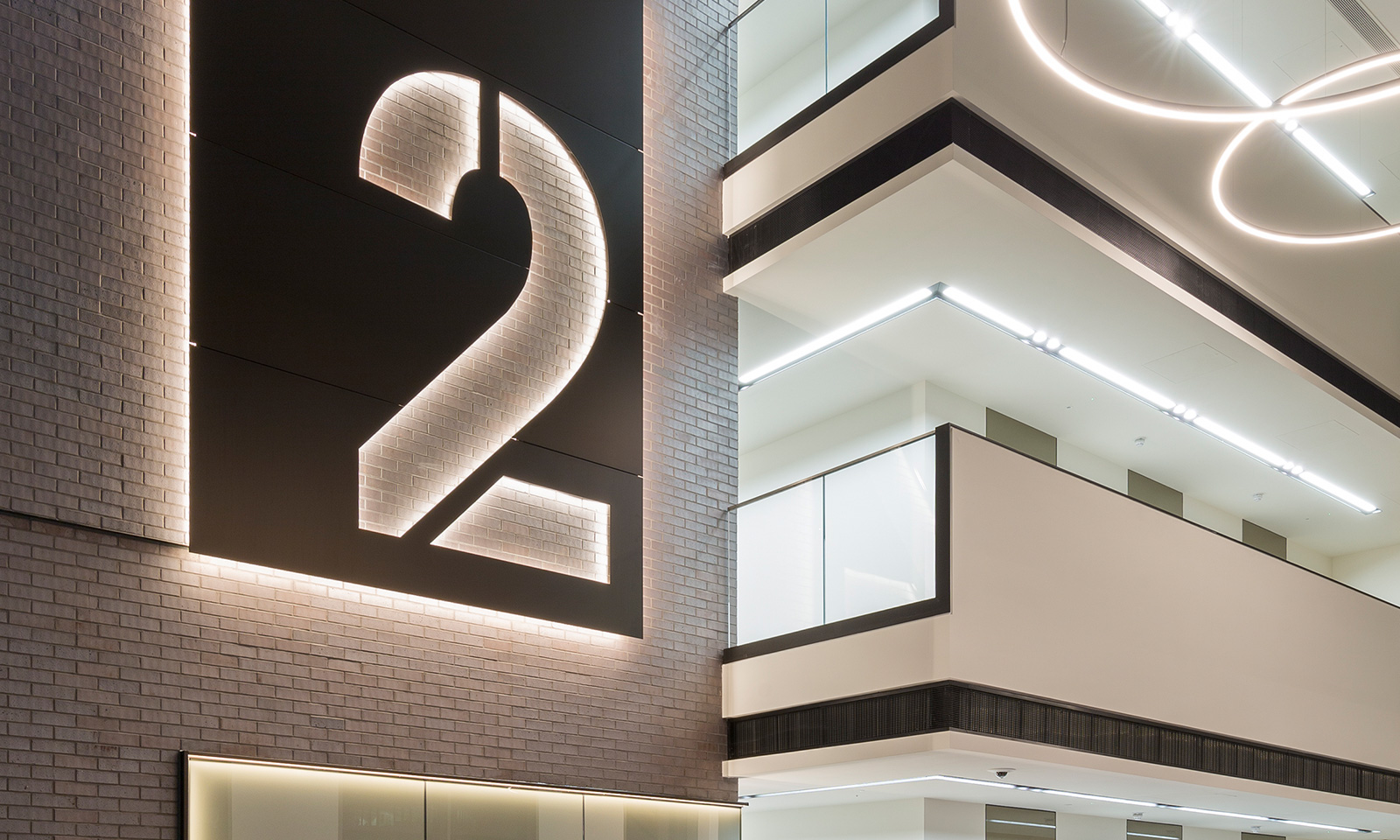
Croxley Park aspires to be one of the top UK business parks, competing on a national and international scale. However, when it came to achieving those aspirations, promoting its success and communicating its offer, the brand and marketing lacked clarity and conviction.
Through a strategic review we unearthed the key to the park’s success. It wasn’t just the quality of the buildings that kept it fully occupied, but the environment and culture surrounding them. The amenities, events, parkland setting and five-star service all made Croxley Park more than just a place to work.
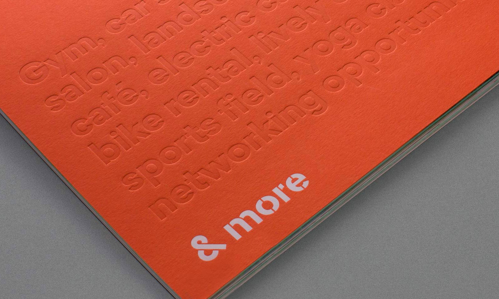
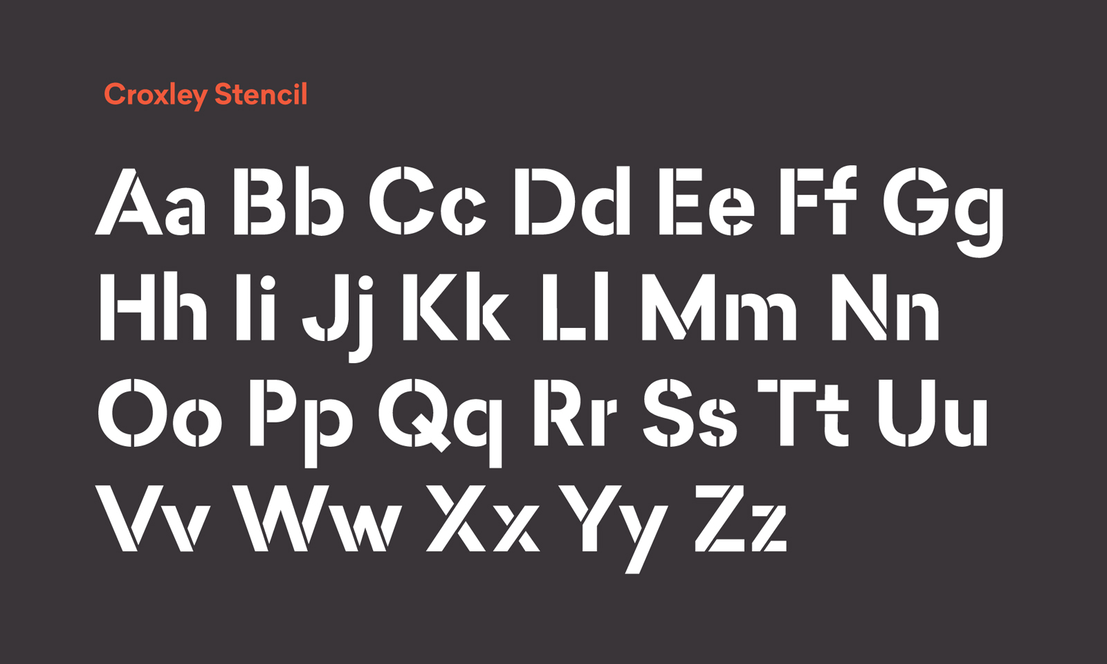
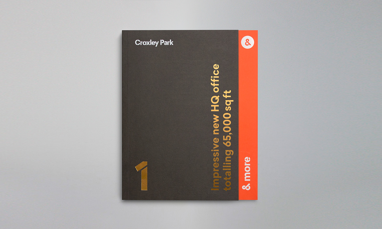
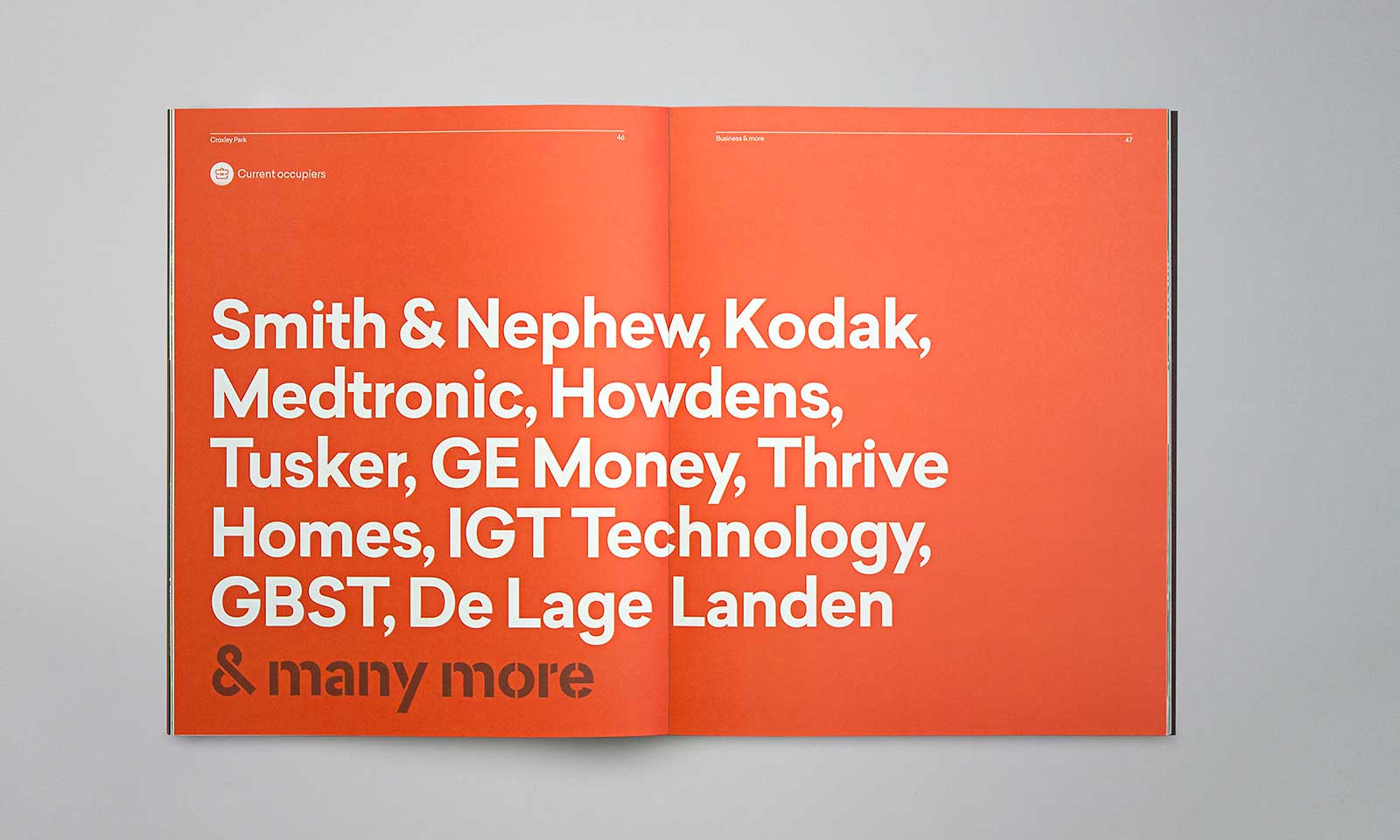
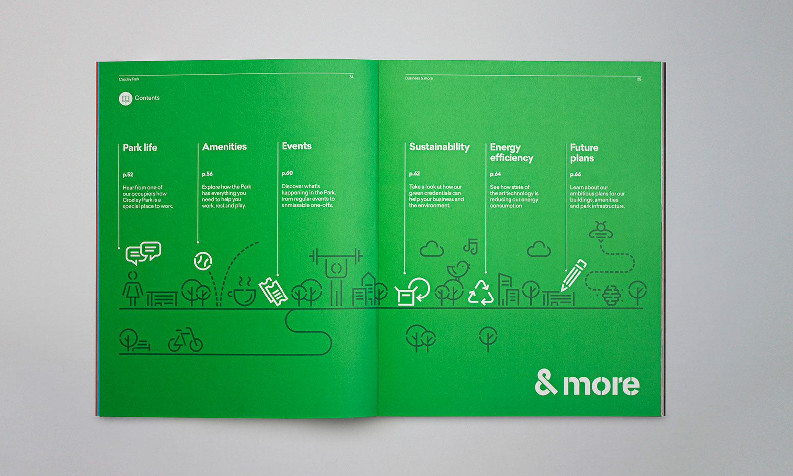
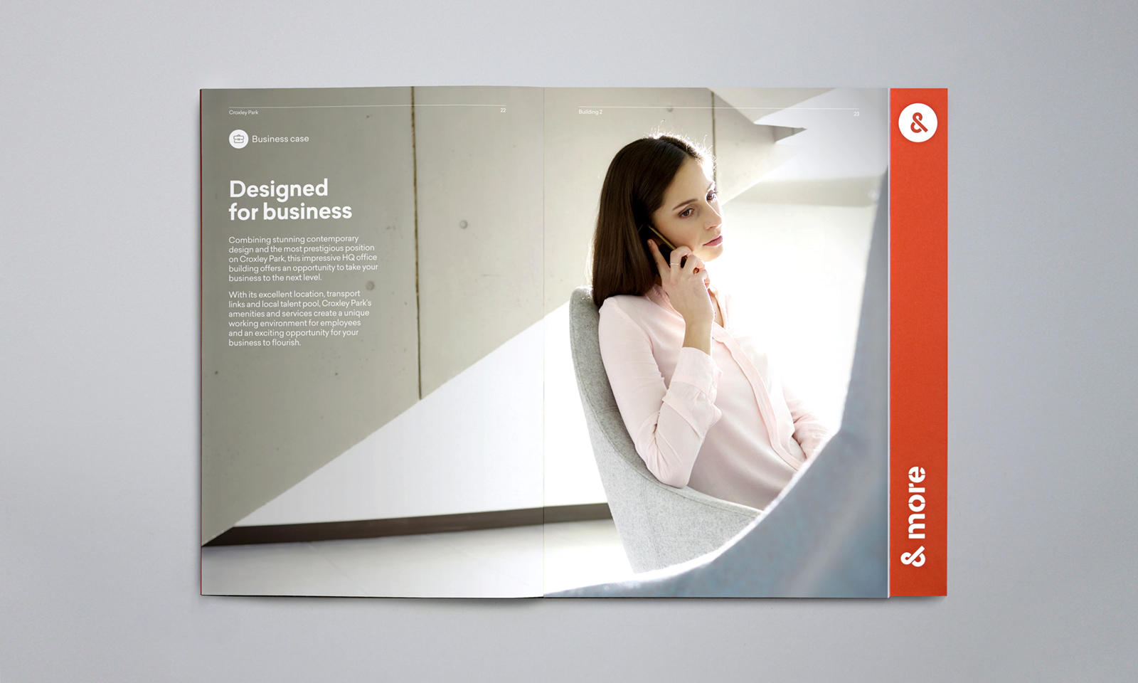
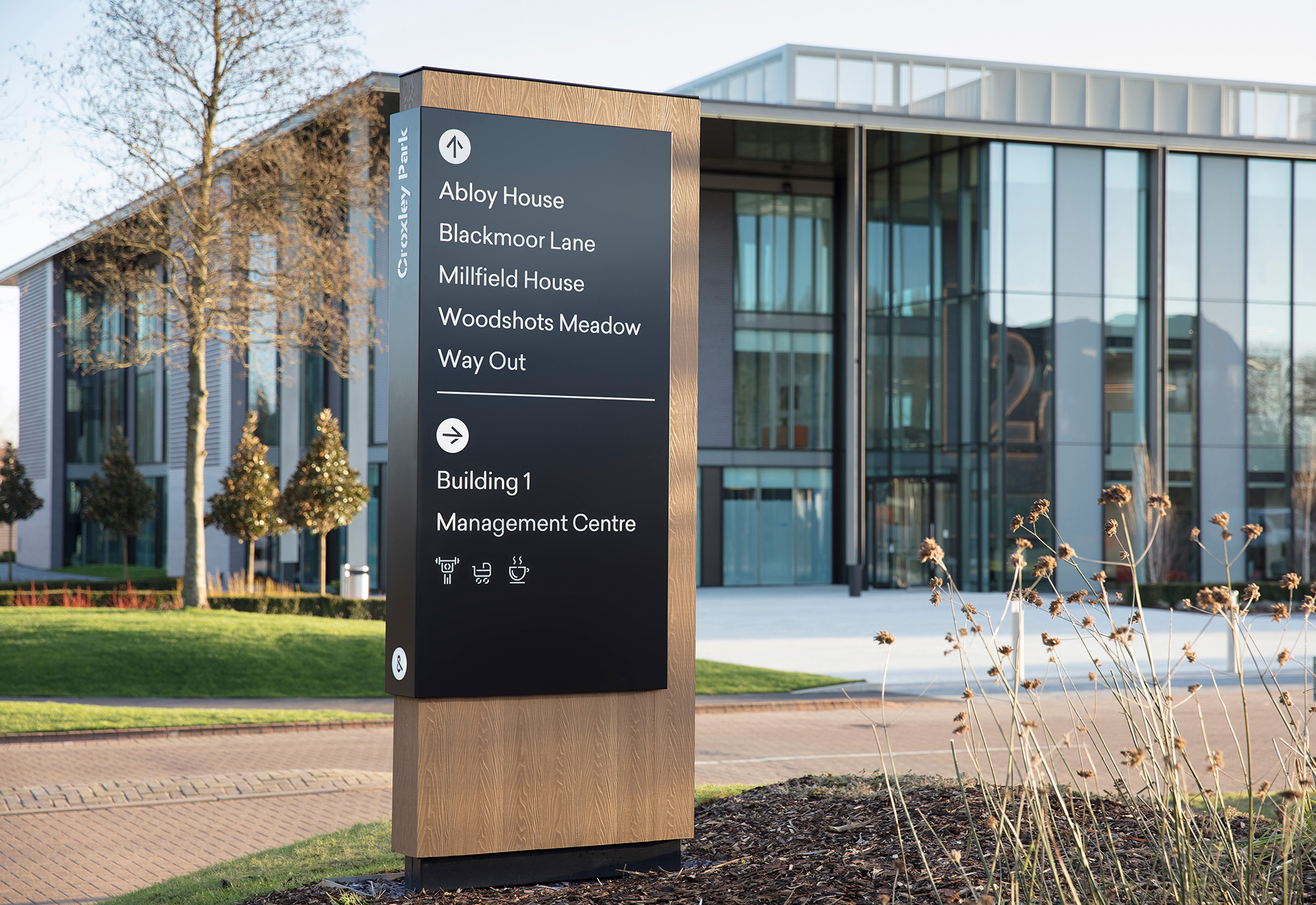
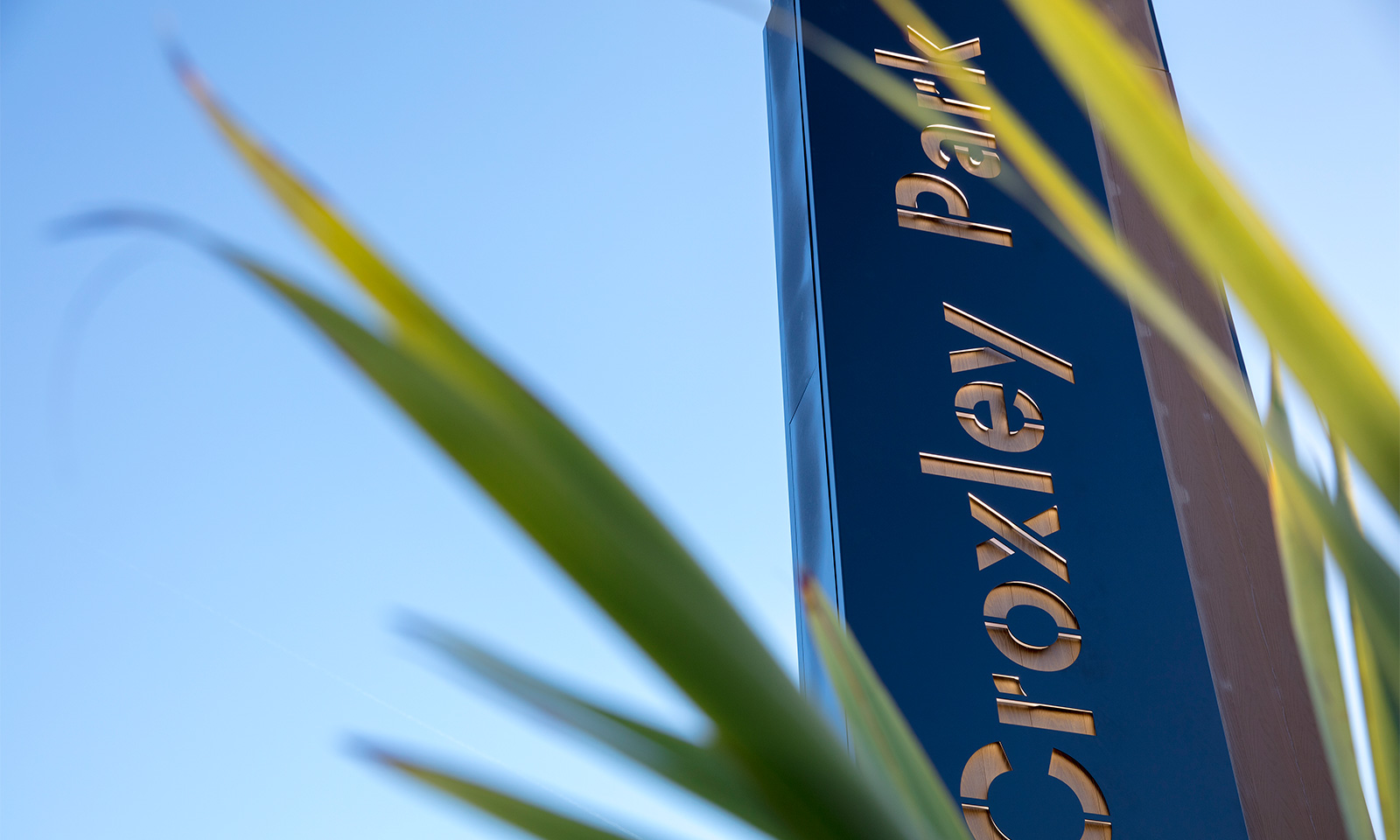
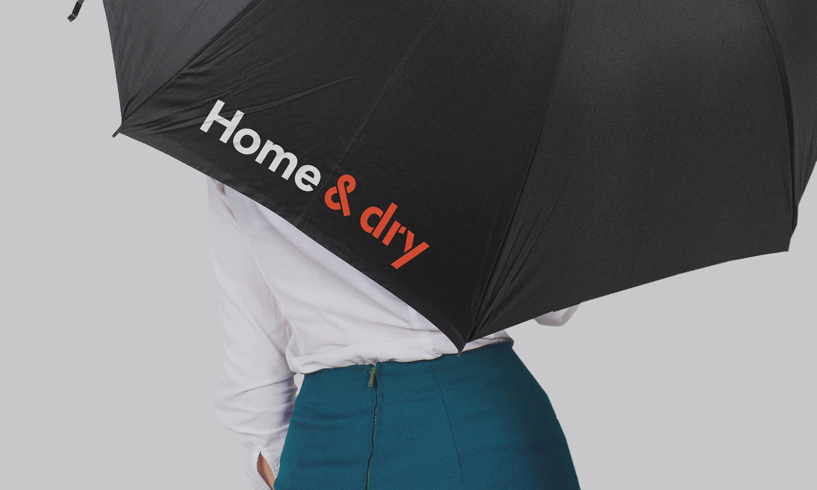
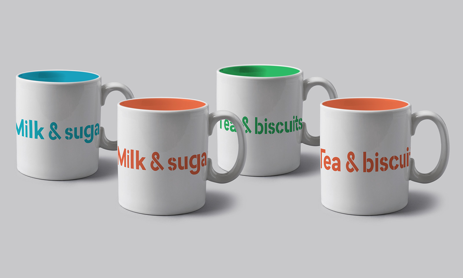
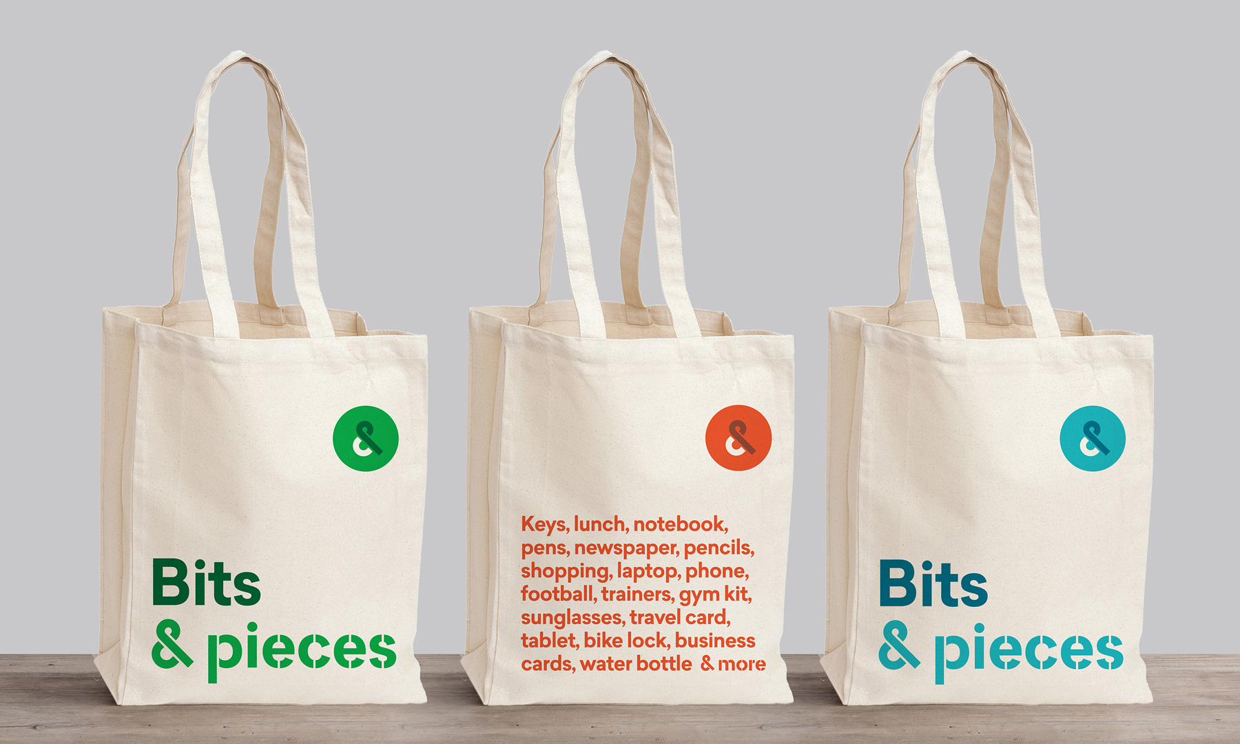
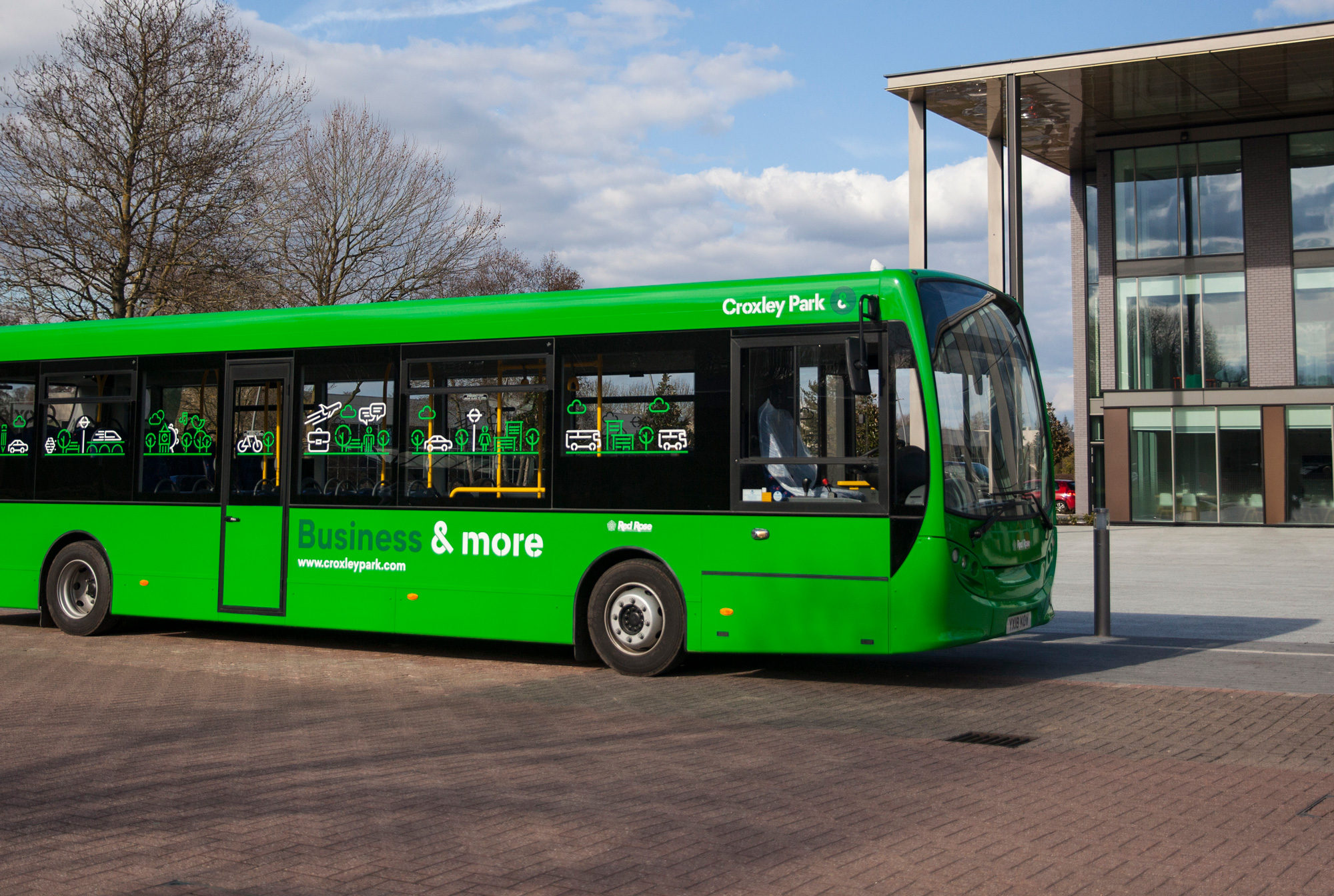
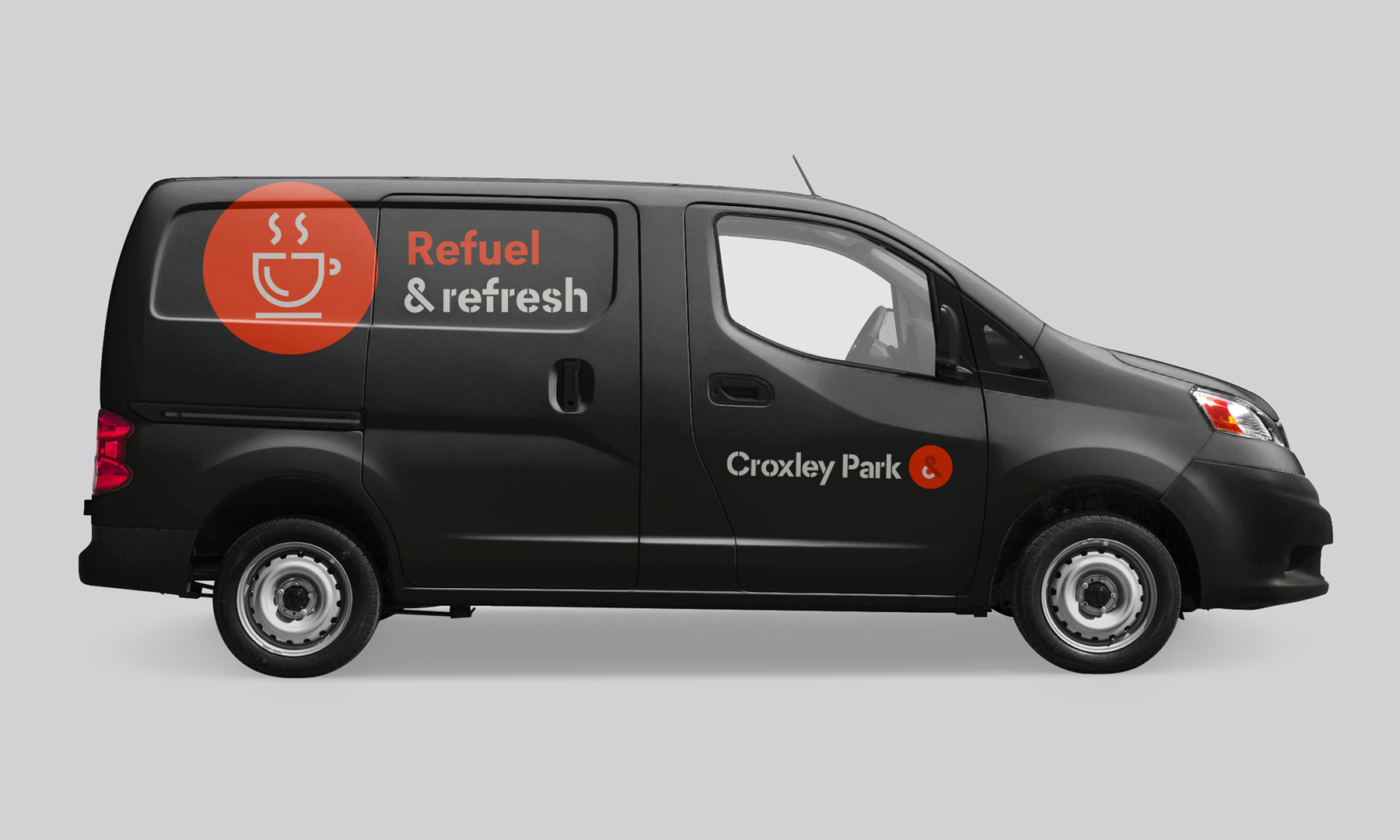
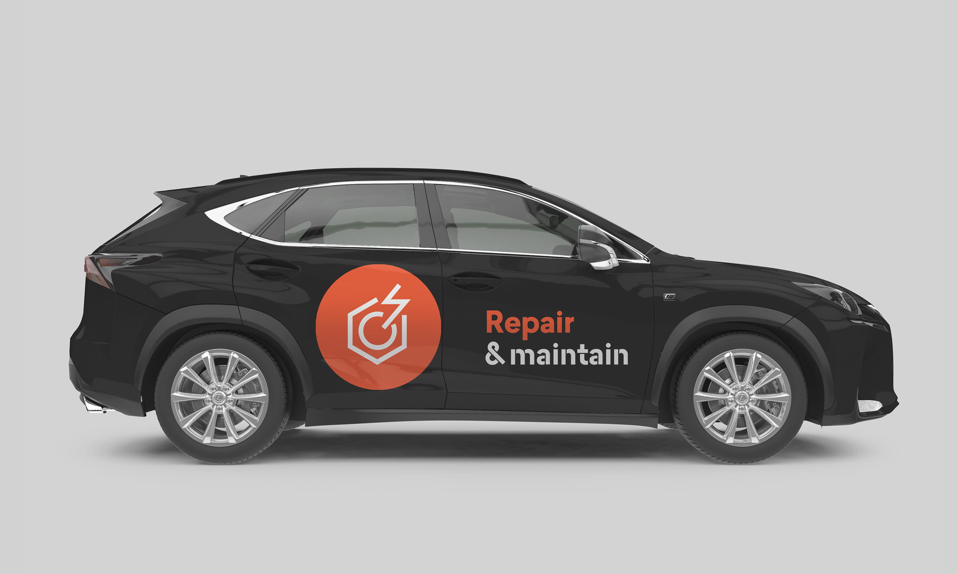
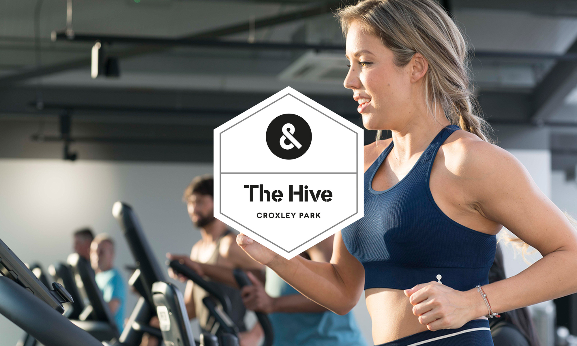
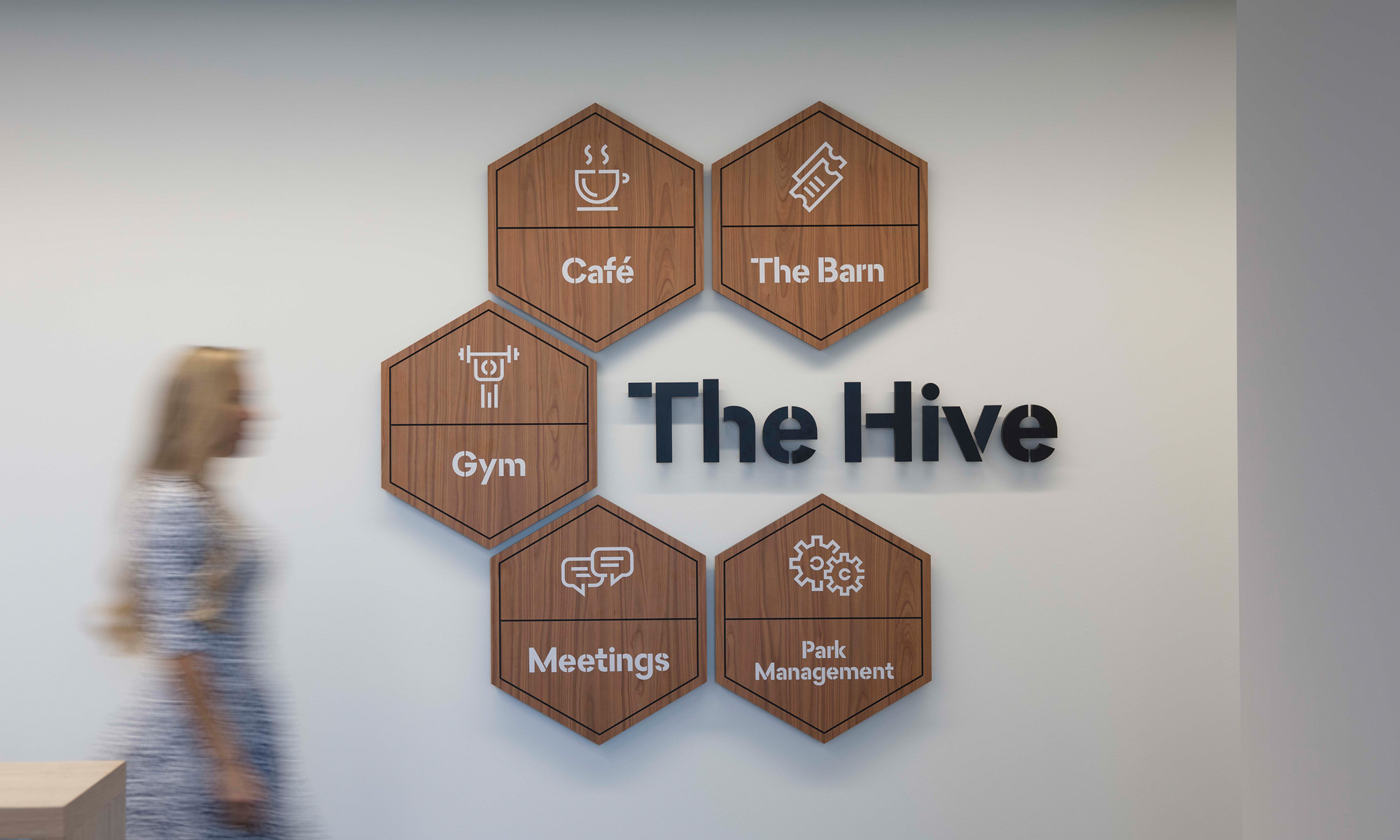
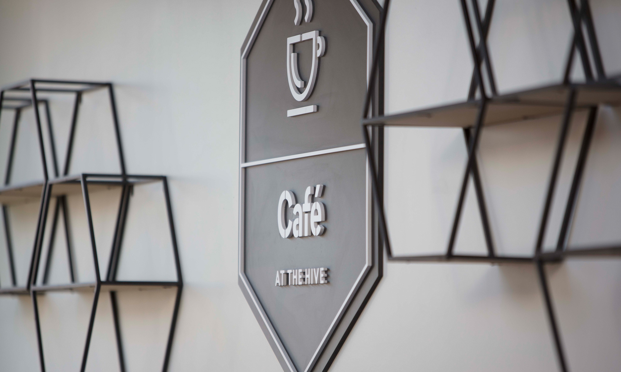
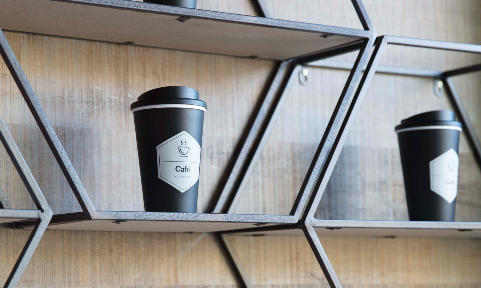
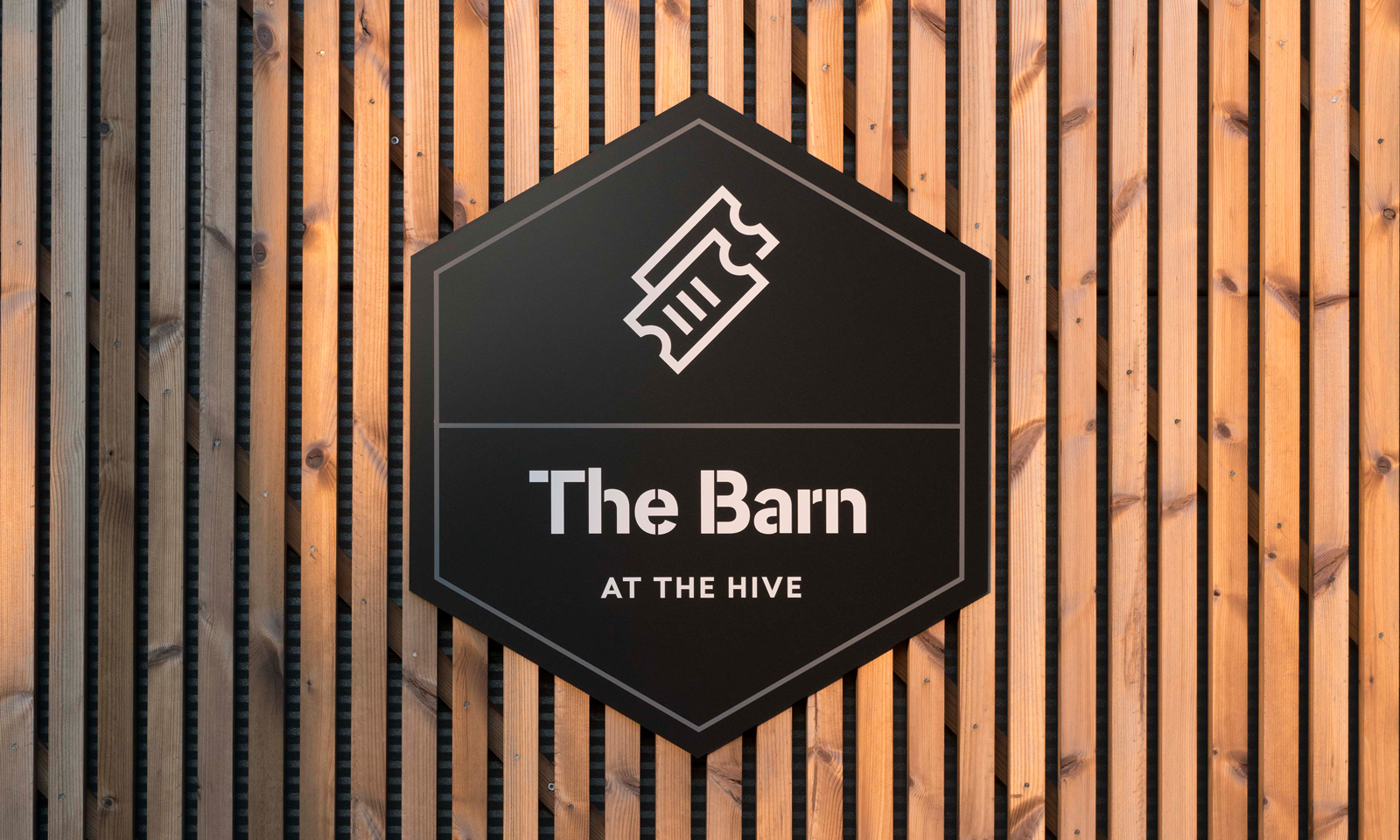
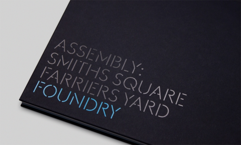
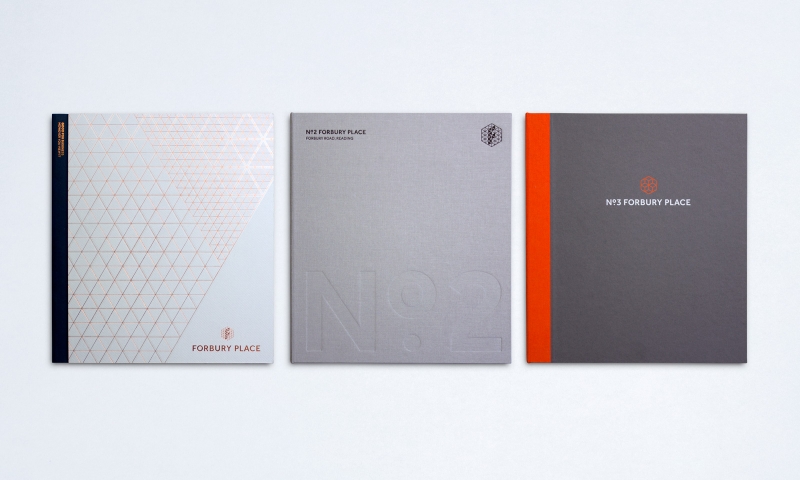
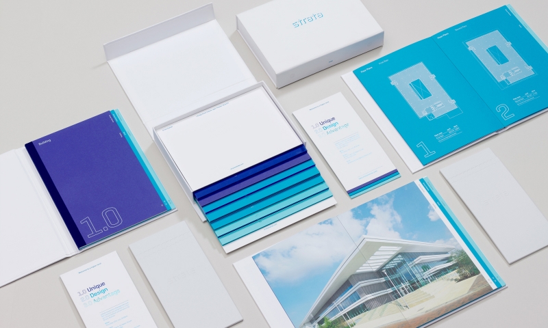
Our concept ‘Business & more’ encapsulates this idea. It enabled us to communicate all the added benefits of the park through a series of creative copy lines. The ‘& more’ concept is reinforced with a new logo, which forms an ampersand from the Croxley Park initials. Together with a bespoke typeface and use of contemporary photography, our concept creates a brand identity that projects the park’s offer. It conveys the Croxley ethos, personality and community atmosphere, whilst clearly distinguishing them from the competition.
Client
Links
Credits
Photography: Fernando Manoso
Copywriting: Serious Oomph!
Film & animation: Nipple
Website build: Mud
Print: Gavin Martin Colournet
